
[Angular Material 完全攻略]打造問卷頁面(4) - Select
前兩天我們很精實的學習的跟Input相關的3個元件-Input、Autocomplete和Datepicker。今天我們用比較輕鬆的步調來介紹另一個常用的元件-Select。
關於Angular Material的Select
在Angular Material中,Select的設計是依循著menus這個單元來設計的,畢竟select與menu其實本質上是大同小異的,都是用來從多個選項中選擇一個或多個答案,所以在設計上風格也不會差太大,只是menu的概念偏向於選擇後執行某個動作,而select則是在作為表單中保存資料的一個元件,也因此跟menu最大不同的是,select支援ngModel和formControlName這類的表單綁定功能。
開始使用Angular Material的Select
在Angular Material中,Select跟Input這類元件一樣,都需要跟<mat-form-field>一起合作,才能發揮最大的威力,而Select的元件都在MatSelectModule之中,加入這個Module之後,我們可以簡單地組合使用<mat-select>和<mat-option>來達到類似HTML的<select>功能,但更具有Material Design的風格。
使用mat-select和mat-option
<mat-select>和<mat-option>使用上非常類似於HTML的<select>和<option>,因此使用上非常容易上手:
<mat-form-field>
  <mat-select formControlName="interest">
    <mat-option *ngFor="let item of interestList" [value]="item.id">{{ item.name }}</mat-option>
  </mat-select>
</mat-form-field>
看起來是不是跟我們直接用<select> / <option> 產生的語法差不多啊!但畫面上可就是滿滿的Material Design了!
小技巧:如果沒有要搭配表單的話,可以直接使用[(value)]來達到two way binding的效果。
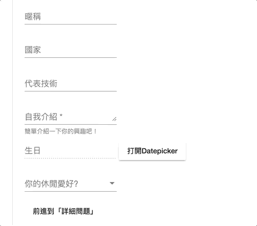
設定placeholder屬性
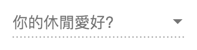
上面的select雖然充滿了Material Design的風格,但還差了一點,就是沒有像Input類型的placeholder來替代label顯示欄位名稱。在原生HTML中select是沒有placeholder可以使用的,比較常見的技巧是透過一個<option [value]="null">text</option>來假裝成placeholder,但在Angular Material中我們可以在<mat-select>元件中直接使用placeholder,實在是非常方便!
<mat-form-field>
  <mat-select formControlName="interest" placeholder="你的休閒愛好?">
    <mat-option *ngFor="let item of interestList" [value]="item.id">{{ item.name }}</mat-option>
  </mat-select>
</mat-form-field>
結果如下:

畫面上看起來就更加一致啦!
設定disabled屬性
不管是<mat-select>還是<mat-option>,都能夠透過disabled來設定其允許被選取的狀態。我們先看看在<mat-select>加上disabled屬性後的樣式:
<mat-form-field>
  <mat-select formControlName="interest" placeholder="你的休閒愛好?" disabled>
    <mat-option *ngFor="let item of interestList" [value]="item.id">{{ item.name }}</mat-option>
  </mat-select>
</mat-form-field>
結果如下:
可以看到整個select變成虛線底線,代表了disabled的狀態。
接著我們看看mat-option加上disabled屬性後的結果:
<mat-form-field>
  <mat-select formControlName="interest" placeholder="你的休閒愛好?">
    <mat-option *ngFor="let item of interestList; let index = index" [value]="item.id" [disabled]="index === 1">{{ item.name }}</mat-option>
  </mat-select>
</mat-form-field>
結果如下:
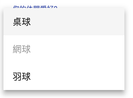
被設定為disabled屬性的選項變成灰底,也就無法選取囉。
還原mat-select的選取狀態
目前設定好<mat-option>並進行選擇後,是無法取消目前的選取狀態的,這會使得選項非必填無法反悔,這時候我們可以加入一個沒有設定[value](其實也就是[value]="undefined")的<mat-option>,當選到這個選項時,就會自動跳回沒有選擇任何選項的模式,也就是還看得到placeholder的狀態:
<mat-form-field>
  <mat-select formControlName="interest" placeholder="你的休閒愛好?">
    <mat-option [value]="undefined">無</mat-option>
    <mat-option *ngFor="let item of interestList; let index = index" [value]="item.id" [disabled]="index === 1">{{ item.name }}</mat-option>
  </mat-select>
</mat-form-field>
結果如下:
當我們選到「無」的時候,就會自動換成最原始顯示placeholder的狀態啦!
使用mat-optgroup群組為選項分群組
HTML的select可以使用<optgroup label="xxx">來為<option>分組放置,Angular Material當然也不會忽略掉這部分,在Angular Material中我們可以使用<mat-optgroup>來達到一樣的功能,要設定整個群組的disabled狀態也完全沒問題!
<mat-select formControlName="interest" placeholder="你的休閒愛好?">
  <mat-option [value]="undefined">無</mat-option>
  <mat-optgroup *ngFor="let parent of nestInterestList; let index = index" [label]="parent.name" [disabled]="index===1">
    <mat-option *ngFor="let child of parent.subItems" [value]="child.id">{{ child.name }}</mat-option>
  </mat-optgroup>
</mat-select>
結果如下:
資料依照mat-optgroup方式分群組顯示,而當mat-optgroup有設定disabled時,整個群組也會直接變成不可選取的灰色狀態,使用上真的跟原生的感覺很像呢!
設定multiple變更多選狀態
跟原生的select一樣,我們也可以透過設定mutiple屬性,讓<mat-select>變為可複選狀態,此時binding的資料將會變成一個陣列,同時選擇[value]="undefined"的mat-option也只會讓陣列中多一個undefined元素而已,要還原成原來的狀態只需要不勾選任何選項即可。
<mat-form-field>
  <mat-select formControlName="interest" placeholder="你的休閒愛好?" multiple>
    ...
  </mat-select>
</mat-form-field>
結果如下:
在mutiple中屬性有一點值得注意的是,這個屬性不可為動態的,也就是無法以設定[multiple]="isMultiple"這樣的方式來切換單/多選狀態,因為這個狀態會影響顯示的邏輯,因此是在元件產生時就決定好了,若需要切換mutiple狀態,請使用ngIf或ngSwitch來變換,例如:
<mat-select *ngIf="isMultiple" multiple>
  ...
</mat-select>
<mat-select *ngIf="!isMultiple">
  ...
</mat-select>
使用mat-select-trigger自訂label顯示資料
<mat-select>有自己的顯示資料的方式,這部分我們可以透過<mat-select-trigger>覆蓋掉原來的顯示資料方式:
<mat-form-field>
  <mat-select formControlName="interest" #selectInterest placeholder="你的休閒愛好?" multiple>
    <mat-select-trigger>
      共選擇了 {{ selectInterest.selected.length }} 項興趣
    </mat-select-trigger>
    ...
  </mat-select>
</mat-form-field>
成果如下:

我們成功地自訂了資料顯示的邏輯,透過<mat-select-trigger>資料呈現就不再死板啦!
取消ripple特效
預設的<mat-select>在選取時會有一個漣漪的效果,如下:
如果不喜歡,可以設定disableRipple:
<mat-form-field>
  <mat-select ... disableRipple>
    ...
  </mat-select>
</mat-form-field>
結果如下:
沒有特效可能看起來會比較清爽,但也可能會比較無聊,至於怎麼樣顯示比較好,就看個人喜好囉。
自訂下拉panel的樣式
<mat-select>提供了panelClass屬性,方便我們自訂下拉選單的樣式,我們可以先在<mat-select>中設定這個屬性:
<mat-form-field>
  <mat-select ... panelClass="blue-dropdown">
    ...
  </mat-select>
</mat-form-field>
接著需要提醒的是,由於這些功能都被拉到共用的Angular CDK的關係,因此若直接在component.css中設定會無效,除非額外設定ViewEncapsulation,或是直接在全域的style.css中加入就好:
.blue-dropdown .mat-select-content {
  background: rgba(0, 0, 255, 0.5);
}
成果如下:
本日小結
今天我們介紹了另一個實用的元件mat-select,這個元件使用上幾乎跟HTML原生的select一樣,大部分的設定都非常直覺好懂,同時Angular Material又針對mat-select增加了更多的功能及細微可以調整的地方,讓下拉選單的功能更加豐富好用!
關於這幾天我們一直提到一個包在我們的表單控制項之外的元件mat-form-field,是一個讓輸入控制欄位活起來的強大外皮,明天我們再來仔細地介紹它!
本日的程式碼GitHub:https://github.com/wellwind/it-ironman-demo-angular-material/tree/day-12-select
分支:day-12-select