
[Angular Material 完全攻略]雜項技巧(1) - 自己的theme自己設計
Angular Material內建了4種不同主題的theme,未來應該還會持續增加,但這些theme未必是我們喜歡的,而在Angular Material中,要設計自己的theme非常簡單,我們就來看看該如何做吧!
建立自己的theme
建立一個theme相關的scss檔
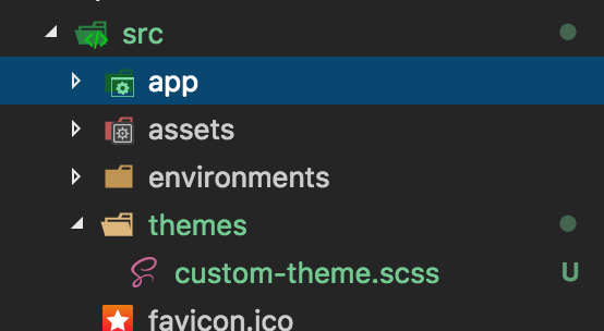
Angular Material使用SCSS來設計,並提供了許多的@mixin可以使用,讓我們輕易就能夠客製化顏色的功能,首先第一步,我們先在專案下建立一個custom-theme.scss檔案,如下圖:
匯入核心功能
加入包含Angular Material的theming,並匯入基本的樣式:
@import '~@angular/material/theming';

@include mat-core();
在執行@include mat-core()後,會將所有元件都共用的基本樣式都加入,因此這個動作只需要做一次就好。
自訂顏色
接著我們就可以來設定theme的顏色囉,Material Design已經訂了許多顏色的調色盤,同時在Angular Material中都有設計好對應主色的變數,舉例來說:light blue的顏色就可以使用$mat-light-blue,而pink則可以使用$mat-pink;我們可以透過Angular Material另位提供的輔助工具mat-palette(),來設定這些顏色的亮度。例如:
$custom-primary: mat-palette($mat-light-blue);
另外我們也能提供3個參數,分別為,顏色主要的亮度(預設為500),淺色的色調以及深色的色調
$custom-accent: mat-palette($mat-orange, 500, A100, A700);
不過最後兩個參數在theme中其實用不到,我們可以忽略它。
在這裡我們先把Material Design中的三種主要色彩都定義好,如下:
$custom-primary: mat-palette($mat-light-blue, 500); /* 500是預設值,也可以忽略 */
$custom-accent: mat-palette($mat-green);
$custom-warn: mat-palette($mat-brown);
建立theme
接下來我們可以使用mat-light-theme建立淺色主題,或mat-dark-theme建立深色主題,之後只需要使用@include angular-material-theme()就可以取得所有的顏色結果啦!
/* 建立深色主題 */
$custom-theme: mat-dark-theme($custom-primary, $custom-accent, $custom-warn);

@include angular-material-theme($custom-theme);
加入自訂的樣式
最後我們要在style.css中加入樣式,不過要記得我們目前是用SCSS,因此要將style.css改為style.scss,同時修改.angular-cli.json的app.styles,最後在style.scss中加入我們自訂的樣式,就完成啦!
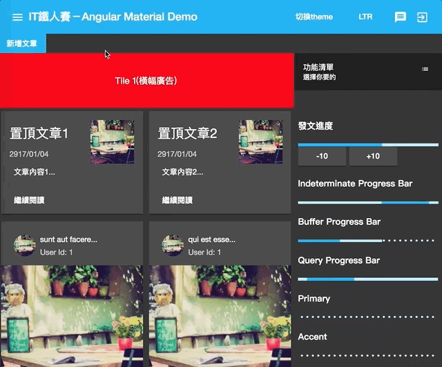
結果如下:
看起來是不是別有一番風味啊!
如果不知道顏色怎麼搭比較好,可以到 Material Design Color Palette Generator這個網站,隨意選擇兩種顏色,就可以看到效果參考囉!
建立多個theme並動態切換
要建立多個theme也很簡單,把@include angular-material-theme();的部分放到一個css class下,再切換不同的class就可以了,如下:
@import '~@angular/material/theming';

@include mat-core();

$custom-primary: mat-palette($mat-light-blue);
$custom-accent: mat-palette($mat-green);
$custom-warn: mat-palette($mat-brown);

$custom-theme: mat-dark-theme($custom-primary, $custom-accent, $custom-warn);

.custom-theme-1 {
  @include angular-material-theme($custom-theme);
}

$custom-primary-2: mat-palette($mat-yellow, 800);
$custom-accent-2: mat-palette($mat-deep-orange);
$custom-warn-2: mat-palette($mat-pink);

$custom-theme-2: mat-dark-theme($custom-primary-2, $custom-accent-2, $custom-warn-2);

.custom-theme-2 {
  @include angular-material-theme($custom-theme-2);
}
上面的程式中,我們使用兩組變數,並分別放到.custom-theme-1及.custom-theme-2之中,只需要切換不同的class,就可以改變整個畫面囉!
多個theme切換時的注意事項
當有多個theme時,由於overlay通常會在theme的範圍之外,因次在需要dialog這類的程式顯示為異常,如下:
這時候我們必須做額外的設定,這時候我們需要注入OverlayContainer,並透過它取得overlay的container,然後把樣式加上去:
import { OverlayContainer } from '@angular/cdk/overlay';

@Component({ })
export class DashboardComponent implements OnInit {
  theme = 'custom-theme-1';

  constructor(private overlayContainer: OverlayContainer) { }

  ngOnInit() {
    this.overlayContainer.getContainerElement().classList.add(this.theme);
  }

  toggleTheme() {
    const originalTheme = this.theme;
    this.theme = this.theme === 'custom-theme-1' ? 'custom-theme-2' : 'custom-theme-1';
    this.overlayContainer.getContainerElement().classList.remove(originalTheme);
    this.overlayContainer.getContainerElement().classList.add(this.theme);
  }
}
這時候再切換就會一切正常啦!
本日小結
今天我們學到使用Angular Material所提供的SCSS,並了解到Material Design的調色盤中,在Angular Material都有對應的顏色,只需要使用$mat-xxxx變數即可,而透過mat-palette()可以得到實際顏色的配置,包含亮色調及暗色調。
最後我們使用mat-dark-theme()來取得深色的主題顏色,當然也能夠使用mat-light-theme來得到亮色的主題,最後再使用angular-material-theme()得到完整Angular Material裡面相關元件的class。
由於SCSS的特性,我們也能輕易把這些主題樣式包裝到另外一個class之中,來達到切換樣式的效果,可以說是非常的有彈性啊!
本日的程式碼GitHub:https://github.com/wellwind/it-ironman-demo-angular-material/tree/day-32-theme
分支:day-32-theme
有了簡單的theme概念後,明天再來講幾個在開發Angular Material上會很實用的小技巧吧!